This will be a quick read.
This week’s #TidyTuesday dataset brings to us the details behind the official R4DS Slack channel. It’s got a ton of interesting behind-the-scenes data in it, like the number of active daily members, the percentages of messages being shared as DMs, and of course, the number of messages being posted for a given day.
I don’t do something especially new here, everything I’ve done can be spotted in one of my previous blog posts. That didn’t demotivate me from putting up a blog post, though.
Let’s begin!
As always, I load in the tidyverse package, after which I then glimpse() the data to get an idea of what possibilities lie before me.
library(tidyverse) #meta-package for streamlining data analysis
library(lubridate) #for handling dates
library(patchwork) #for arranging plots
library(ggforce) #for geom_sina()

theme_set(theme_light()) #personal theme preference

r4ds_members <- readr::read_csv("https://raw.githubusercontent.com/rfordatascience/tidytuesday/master/data/2019/2019-07-16/r4ds_members.csv") #reading in the data

r4ds_members %>%
  glimpse() #glimpsing the data to get a feel of it
## Rows: 678
## Columns: 21
## $ date                                 <date> 2017-08-27, 2017-08-28, 2017-08-…
## $ total_membership                     <dbl> 1, 1, 1, 1, 1, 188, 284, 324, 354…
## $ full_members                         <dbl> 1, 1, 1, 1, 1, 188, 284, 324, 354…
## $ guests                               <dbl> 0, 0, 0, 0, 0, 0, 0, 0, 0, 0, 0, …
## $ daily_active_members                 <dbl> 1, 1, 1, 1, 1, 169, 225, 214, 203…
## $ daily_members_posting_messages       <dbl> 1, 0, 1, 0, 1, 111, 110, 96, 67, …
## $ weekly_active_members                <dbl> 1, 1, 1, 1, 1, 169, 270, 309, 337…
## $ weekly_members_posting_messages      <dbl> 1, 1, 1, 1, 1, 111, 183, 218, 234…
## $ messages_in_public_channels          <dbl> 4, 0, 0, 0, 1, 252, 326, 204, 155…
## $ messages_in_private_channels         <dbl> 0, 0, 0, 0, 0, 0, 0, 0, 0, 0, 0, …
## $ messages_in_shared_channels          <dbl> 0, 0, 0, 0, 0, 0, 0, 0, 0, 0, 0, …
## $ messages_in_d_ms                     <dbl> 1, 0, 0, 0, 0, 119, 46, 71, 70, 1…
## $ percent_of_messages_public_channels  <dbl> 0.8000, 0.0000, 0.0000, 0.0000, 1…
## $ percent_of_messages_private_channels <dbl> 0, 0, 0, 0, 0, 0, 0, 0, 0, 0, 0, …
## $ percent_of_messages_d_ms             <dbl> 0.2000, 0.0000, 0.0000, 0.0000, 0…
## $ percent_of_views_public_channels     <dbl> 0.2857, 1.0000, 1.0000, 1.0000, 1…
## $ percent_of_views_private_channels    <dbl> 0, 0, 0, 0, 0, 0, 0, 0, 0, 0, 0, …
## $ percent_of_views_d_ms                <dbl> 0.7143, 0.0000, 0.0000, 0.0000, 0…
## $ name                                 <dbl> 0, 0, 0, 0, 0, 0, 0, 0, 0, 0, 0, …
## $ public_channels_single_workspace     <dbl> 10, 10, 11, 11, 12, 12, 12, 13, 1…
## $ messages_posted                      <dbl> 35, 35, 37, 38, 66, 1101, 1797, 2…
Wow, we have a lot of variables in there. Now at first glance I don’t really see any variables that stand out to me, so I’m going to stick with the obvious here. Let’s explore the rates of messages across each day.
We achieve this by grouped summaries as well as using lubridate.
r4ds_members_processed <- r4ds_members %>%
  mutate(day = wday(date, label = TRUE), #extracting the day
         month = month(date, label = TRUE), #extracting the month
         year = year(date)) #extracting the year

#First plot
#Heatmap across days and months
p1 <- r4ds_members_processed %>%
  group_by(day, month) %>%
  summarise(avgMessages = mean(messages_posted)) %>%
  ggplot(aes(day, month)) +
  geom_tile(aes(fill = avgMessages)) + #filling in tiles with mean # of messages
  scale_fill_distiller(direction = 1) +
  labs(x = "Day",
       y = "Messages posted",
       title = "Heatmap of messages posted across days and months",
       subtitle = "Notable drop as the year ends",
       fill = "Average # of messages posted")
## `summarise()` has grouped output by 'day'. You can override using the `.groups`
## argument.
#Second plot
#Distribution of mean active members daily
p2 <- r4ds_members_processed %>%
  mutate(year = as.factor(year)) %>%
  ggplot(aes(day, daily_active_members)) +
  geom_sina(aes(colour = day), alpha = 0.2) + #Similar to a violin plot, except this plots the points instead of the density curves
  geom_hline(aes(yintercept = mean(daily_active_members)), linetype = 2, size = 0.5) + #for the average # of active members
  labs(x = "Day",
       y = "Daily active members",
       title = "Distribution of daily active members",
       subtitle = "Dotted line represents the mean number of members") +
  guides(colour = FALSE)
## Warning: Using `size` aesthetic for lines was deprecated in ggplot2 3.4.0.
## ℹ Please use `linewidth` instead.
## This warning is displayed once every 8 hours.
## Call `lifecycle::last_lifecycle_warnings()` to see where this warning was
## generated.
## Warning: The `<scale>` argument of `guides()` cannot be `FALSE`. Use "none" instead as
## of ggplot2 3.3.4.
## This warning is displayed once every 8 hours.
## Call `lifecycle::last_lifecycle_warnings()` to see where this warning was
## generated.
p1 + p2 + plot_layout(ncol = 1, heights = c(5,4)) #using patchwork to arrange them
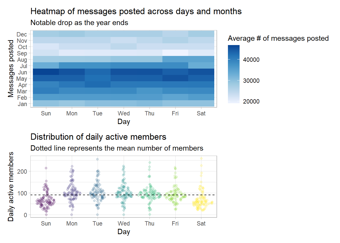 There is a _very_ sharp drop in the average number of messages daily as soon as we hit the months of September through December. I'm not sure why that is. Also, it seems that weekends in the month of June imply a very active R4DS community! This is contrary to my expectations of #TidyTuesday leading to a spike in messages on Tuesdays.
The dataset also contains a few variables that list out details related to the types of messages being shared in the slack channel. This includes messages shared in public channels, messages shared in private channels, or even DMs.
There is a fair possibility that the number of public channels outnumbers the other types of messages, which is why I will be using the variables that contain the percentages of message types, in the interest of maintaining scale.
r4ds_members_processed %>%
  select(day, month, year, contains("percent_of_messages")) %>% #selecting all variables containing "percent"
  gather(key, value, -day, -month, -year) %>% #reshaping our data
  mutate(day = fct_reorder(day, value, sum)) %>% #reordering our factors for our plot
  group_by(day, key) %>%
  summarise(value = mean(value)) %>% #mean number of messages per type per day
  ggplot(aes(day, value)) +
  geom_col(aes(fill = key)) +
  scale_fill_brewer(palette = "Spectral") +
  coord_flip() +
  labs(x = "Day",
       y = "%age of messages",
       title = "Distribution of message types across days",
       subtitle = "Almost consistent distribution\nwith some variation in private channel messages") +
  theme(legend.position = "bottom")
## `summarise()` has grouped output by 'day'. You can override using the `.groups`
## argument.
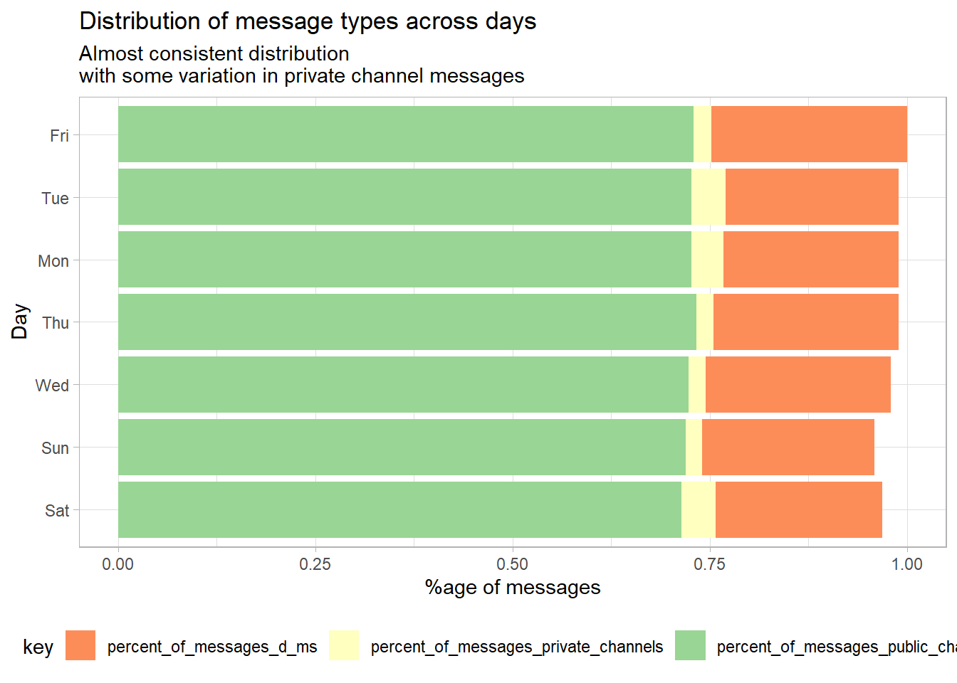
As expected, public messages are the majority by far, every day. In fact, the distribution of messages is almost consistent, with some relative variability arising in the number of messages shared on private channels.
This was a short one, I’m afraid. I’ll be doing my best to do more in subsequent blog posts, however!